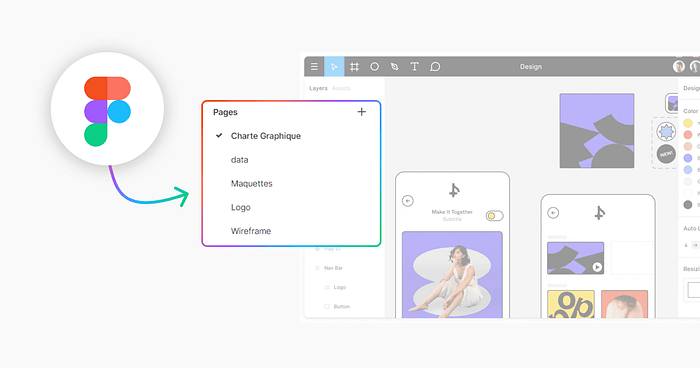
Best Practices for Creating Engaging Landing Pages in Figma

Landing pages are a critical component of digital marketing, designed to capture user attention, deliver a clear message, and drive conversions. Figma, as a collaborative and intuitive design tool, provides everything you need to create visually appealing and functional landing pages. In this guide, we’ll explore best practices for designing engaging landing pages in Figma to maximize their impact.
1. Define the Purpose and Goal
Before diving into design, clearly define the purpose of the landing page and its primary goal.
- Identify the Target Audience: Understand who will be visiting the page and tailor the design to their preferences.
- Set Clear Objectives: Whether it’s capturing leads, promoting a product, or encouraging downloads, the goal should guide every design decision.
- Craft a Clear Value Proposition: Your landing page should immediately communicate why users should take action.
2. Plan the Structure and Layout
An effective landing page layout directs users’ attention to the most important elements.
- Use Wireframes: Start with low-fidelity wireframes in Figma to outline the structure without distractions.
- Above-the-Fold Content:
- Place the headline, subheadline, and CTA (call-to-action) prominently.
- Ensure critical information is visible without scrolling.
- Logical Flow: Arrange content hierarchically, leading users from awareness to action.
3. Leverage Grids and Alignment
Figma’s grid and alignment tools help maintain visual consistency and balance.
- Set Up Grids:
- Use column grids (e.g., 12-column) for responsive layouts.
- Define margins and gutters to ensure spacing is consistent.
- Align Elements: Use alignment tools to ensure headings, text, and buttons are neatly arranged.
4. Design Compelling Visuals
Visuals play a crucial role in grabbing attention and conveying information.
- Hero Images and Videos:
- Use high-quality visuals that align with the brand and message.
- Optimize media for web performance to avoid slow loading times.
- Illustrations and Icons:
- Add custom illustrations or icons to enhance engagement.
- Use Figma’s vector tools or plugins like Iconify for quick access to icons.
- Consistent Style:
- Stick to a cohesive visual style, including colors, shapes, and typography.
5. Focus on Typography
Typography should be clear, readable, and aligned with the brand’s voice.
- Choose Readable Fonts:
- Use sans-serif fonts for a modern and clean look.
- Limit the number of font families to two or three.
- Hierarchy in Text:
- Make headlines larger and bolder to capture attention.
- Use subheadings and body text to support the main message.
- Responsive Text: Ensure font sizes adjust for different screen sizes using relative units.
6. Craft an Effective Call-to-Action (CTA)
Your CTA is the focal point of the landing page. Make it compelling and actionable.
- Button Design:
- Use bold colors that stand out against the background.
- Add hover states for interactivity.
- Action-Oriented Text:
- Use clear and persuasive language, e.g., “Get Started,” “Download Now,” or “Sign Up Free.”
- Positioning: Place CTAs strategically — both above and below the fold, or at logical stopping points in the user journey.
7. Optimize for Conversion
Conversion optimization involves removing friction and guiding users toward action.
- Minimal Distractions:
- Avoid unnecessary links or navigation menus that take users away from the page.
- Use clean, uncluttered designs to maintain focus.
- Trust Signals:
- Include testimonials, reviews, or client logos to build credibility.
- Use security badges or guarantees to reassure users.
- Form Design:
- Keep forms short and simple.
- Use auto-fill features and clear labels for ease of use.
8. Utilize Figma’s Collaboration Features
Figma’s collaboration tools make it easy to design landing pages as a team.
- Comments and Feedback:
- Use Figma’s comment feature to gather real-time feedback from stakeholders.
- Version Control:
- Save versions of your design to track changes and revert if needed.
- Shared Libraries:
- Use shared libraries for consistent components like buttons, forms, and typography styles.
9. Ensure Responsiveness
Responsive design ensures your landing page looks great on all devices.
- Create Frames for Different Devices:
- Design for desktop, tablet, and mobile using Figma’s frame tool.
- Breakpoints:
- Use constraints and auto-layout features to adjust designs for different screen sizes.
- Test Responsiveness:
- Use Figma’s preview tool or plugins to simulate how the design looks on various devices.
10. Test and Iterate
Refining your landing page is crucial for maximizing performance.
- Prototype Testing:
- Use Figma’s prototyping feature to simulate user interactions.
- Share prototypes with users or stakeholders for testing.
- Heatmaps and Analytics:
- Integrate heatmaps or analytics tools to track user behavior and identify pain points.
- A/B Testing:
- Create multiple versions of the landing page in Figma to test different designs.
Conclusion
Creating engaging landing pages in Figma is both an art and a science. By following these best practices — from planning and designing to testing and iterating — you can craft landing pages that captivate users and drive conversions. With Figma’s powerful tools and collaborative features, the process becomes efficient and enjoyable. Stay user-focused, leverage analytics, and keep refining your designs to achieve maximum impact.
My Fiver link for : Figma Landing Page Design Service
